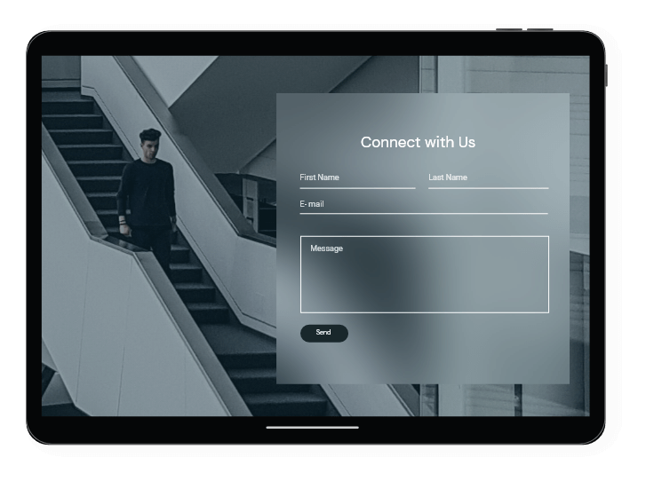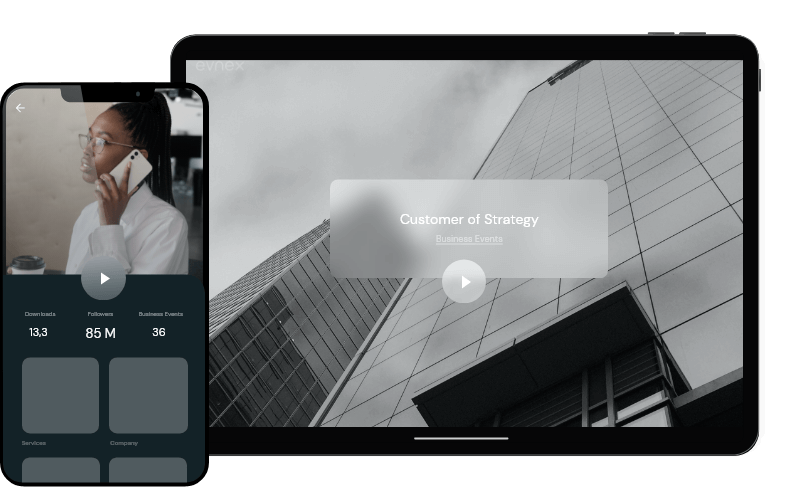
Convey your professionalism and expertise
We Analyze Every Aspect of Your Business.
To see what the pain points of your current brand configuration & strategy are, summarized in a comprehensive report.
Position yourself flawlessly.
We analyze competitors, consumer patters, market painpoints, and strategic choices to make sure you offer the best mix of products and services. We then help you through the implementation.

We take care of all the facets of your brand.
We focus on your company's public persona and identity to increase alignement with your core values and objectives. We specialize in crafting distinctive visual elements, formulating effective communication strategies, and establishing a cohesive brand aesthetic that engages and attracts your target audience.

We align your brand to the digital space.
We ensure consistency and compatability across all digital platforms such as websites, social media, and email campaigns. We also implement SEO and content marketing strategies to improve online visibility and engagement. Additionally, we utilize analytics to monitor brand performance and adapt our strategies for maximum impact and alignment with evolving digital trends.
Browse our portfolio
See how we have revitalized brands and brought ideas to life.
Step by Step
Our Brand Development and Redesign Process
Throughout the entire process, we maintain open communication with you, incorporating feedback and revisions at each step. This ensures that the final branding elements truly resonate with your vision and meet your satisfaction.
Understand Brand's Vision
Before diving into the practical steps, it's essential to have a deep understanding of your brand's core values, mission, and vision. This understanding forms the foundation of every subsequent step in the branding process, ensuring that all efforts align with what your brand truly represents.
Competitor Analysis
This step involves thoroughly researching your competitors to understand their strengths and weaknesses. By analyzing their branding strategies, you can identify opportunities to differentiate your brand and find a unique position in the market.
Logo Redesign and Creation
A logo is often the first visual contact a customer has with a brand. During this phase, we focus on creating or redesigning a logo that reflects your brand's identity and values. We involve clients in every step of the design process, from initial concepts to final revisions, ensuring the logo perfectly represents the brand.
Create a Color Palette
Colors evoke emotions and convey messages. Selecting the right color palette is crucial for brand recognition and consistency across all mediums. We choose colors that resonate with your brand's personality and appeal to your target audience, with room for adjustments based on your feedback.
Choose a Relevant Font
Typography plays a significant role in brand perception. We select fonts that not only complement your brand's aesthetic but also ensure readability and accessibility across various platforms. This step includes exploring different font styles and making adjustments based on your preferences and brand needs.
Create complementary digital assets
To ensure a cohesive brand experience, we design digital assets such as business cards, letterheads, email templates, and social media graphics. These assets are tailored to align with your brand’s visual identity, ensuring consistency and professionalism in every interaction with your audience.
Final Brand Presentation
This final step is the culmination of all the previous efforts. Here, we present the complete brand package, showcasing how each element - from the logo and color palette to the typography and digital assets - seamlessly integrates to form a cohesive and compelling brand identity. This presentation includes real-life mockups and examples of how the branding will look in various applications, providing a tangible sense of the brand's new visual identity. We encourage detailed feedback and are prepared to make any necessary adjustments to ensure that the final result not only meets but exceeds your expectations. This step solidifies your brand's new identity, ensuring it is ready for a successful market launch.
Client Case Study
* Names have been changed for confidentiality purposes.
Before and After
Old Logo
1. Typography Concerns: The font choice for “MARKSMAN PLUMMING LTD.” is relatively plain and does not convey a strong brand presence.
2. Color Palette: The use of a single blue tone throughout the logo doesn’t provide much contrast, which can affect the logo’s visibility and memorability. Introducing an additional color or a range of blue shades could create more depth and visual interest.
3. Complexity of Design: The logo incorporates detailed elements such as water motion within the circle, which might not be clear at smaller sizes. Simplification could enhance clarity and make the logo more adaptable across different media.
4. Symbolism and Clarity: The faucet and water drop effectively suggest plumbing services, but the encompassing circle with the water motion graphic could be mistaken for other symbols and might not immediately convey “plumbing services” to all viewers.
5. Spacing and Proportion: There seems to be a disproportion between the size of the icon and the text, with the icon dominating the design. Adjusting the size ratio could help achieve a more balanced composition.
6. Alignment and Hierarchy: The alignment of the text requires adjustment as “SOUTH CALIFORNIA” appears to be off-center in relation to the company name above it. Also, establishing a clearer hierarchy between the company name and the additional text can guide the viewer’s attention more effectively.
New Logo
1. Strong Theme: The inclusion of a faucet and a home clearly communicates the nature of the business, plumbing, directly relating to homes and buildings. This visual connection is immediate and effective for brand recognition.
2. Good Use of Negative Space: The design creatively uses negative space within the house figure to suggest pipes, which is a smart visual play that ties into the plumbing theme.
3. Color Scheme: The use of a monochromatic color scheme gives the logo a professional and cohesive look. The dark blue is a good choice for plumbing services, often associated with water and cleanliness.
4. Emblem Style: The badge-like shape gives a sense of tradition and establishment. It also makes the logo versatile for various applications, such as uniforms, vehicles, and signage.
5. Establishment Date: Including “ESTD 2023” adds a historical aspect, suggesting reliability and experience, even if the company is relatively new.
6. Clear Typography: The choice of bold, capitalized letters for the business name enhances readability and provides a strong visual impact.
7. Symmetry and Balance: The design is well-balanced and symmetrical, which is aesthetically pleasing and conveys stability and professionalism.
